Published January 22, 2013 by David Hecht
Today we have access to increasing amounts of data and analytics, from all kinds of systems and applications that were not easily accessible to business users even 5 or 10 years ago.
“Big Data” it is sometimes called, though more because it sounds cool than the actual size of the data in many cases. With all of this data however, understanding the “meaning” of the data is increasingly difficult.
We all need a way to quickly spot trends, and gain actionable insights from all that data that helps us manage the people and processes in our daily work.
One method I have found to be particularly effective in making use of data is having a series of dashboards automatically updated and then emailed to me nightly or weekly. Hourly between midnight and 4 or 5 AM, Salesforce updates my dashboards and emails them to me, graphs and all, to be reviewed while having my morning coffee and cleaning out the inbox.
Getting dashboards emailed to me eliminates the need to remember to log in and check the correct reports, and makes it easy to spot any anomalies or trends early. If I need more information about a graph or chart, clicking on it in my inbox takes me directly to the underlying report in Salesforce.
And having all the data centralized in Salesforce (hopefully) makes it easy for the data to be up-to-date without any human intervention to combine data sources or update spreadsheets.
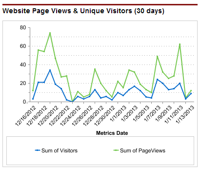
Website traffic via Google Analytics into Salesforce – how many unique visitors, page views, etc. did I get yesterday and where did they come from? How did that big blog post do? Anything that doesn’t look right? (Yes, I know I can log into Google Analytics and see this high level data plus a whole lot more, but I probably won’t — unless an email dashboard alerts me to something that warrants deeper investigation.)
Registrations via backend database integration – if visitors are signing up on a web site or registering for an account with a SaaS product, I want to push that to Salesforce (within a few minutes ideally), so I can correlate visitors with registrations and have a clear view of the top of my funnel.
Leads via Salesforce’s Web-to-Lead form and other sources – how many inquiries are we receiving, and what is happening to them. This should include lead sources, ideally set by an automated tracking system (and yes I have one that I favor), as well as anything sales reps or marketing people enter into Salesforce clearly identified as such for separation in reporting.

Sales activity via Salesforce – How many calls, emails and other activities are happening, and which reps are performing best. Don’t think of this as big brother or keeping the Sales people honest, but more as understanding your business’ sales productivity. And if you haven’t worked in sales before, you have to witness the data to understand that one Sales rep really can make 5 times more calls than another rep (and generally close 5 times as much business, though not always) even though both reps appear productive anecdotally.
Online Advertising Performance – If you are advertising online, Leads or Registrations with daily graphs broken out by advertising publisher is a particularly useful dashboard. You do need to keep some of those ad networks or blogs honest in terms of the impressions they are running and traffic they are sending you. Plus you will be able to see right away if your conversion tracking code was accidentally left off that new landing page, rather than at the end of the month when the numbers are run and it is too late.
Usage data – Integrating usage data from SaaS products or other customer behavior or purchasing information into Salesforce accounts is critical for both lead scoring / account ranking, as well as aggregate numbers on how the business is doing overall. I like to see a dashboard that has total usage (or whatever the key metric that shows customer adoption is) across all customers, as well as a list of top accounts, new accounts with high usage, and potential churn accounts whose usage / purchasing has recently dropped off.

Conversion funnel – what are the trends in terms of lead conversion / opportunity creation, and how does the top of the funnel look in terms of volume.
Sales Pipeline – what Salesforce Opportunities are open, if there are free trials which are expiring in the next week or two, how many deals are at each stage, and is anything neglected or staying open forever without movement?
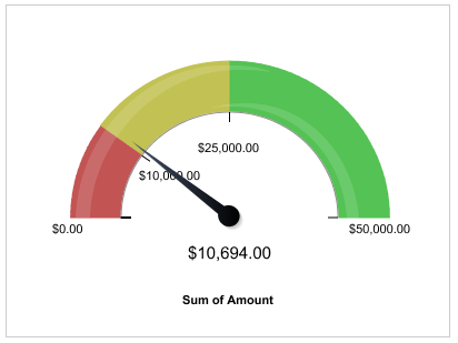
Revenue – If you have a billing or other financial system integrated into Salesforce, it is nice to have some revenue dashboards as well. It isn’t a substitute for financial reporting (and won’t make the accountants happy), but can help you see total revenue, new sales, and understand some high level financial trends, even if it isn’t accurate to the penny.
By reviewing daily or weekly dashboards emailed from Salesforce, you can start each day with a quick overview of your business, and an easy opportunity to understand any trends and spot problem areas or successes. In addition, building these dashboards will ensure that you have all or most of the data that you need in Salesforce for other people to use, so it can make the chances of success much greater if you are just rolling out Salesforce CRM.
You may need to dive back into any one of a number of systems to see further details in the data, or use more sophisticated analytical tools to understand the correlations between different data sets. But ultimately having the data summarized, automatically updated and emailed to you in dashboards is a great way to stay on top of the top line numbers and trends in your business.
How are you using dashboards, and do you get them via Email? Let me know in the comments below.

|
David Hecht Founder, CloudAmp |
| CloudAmp Apps for Salesforce |
Know where your best Salesforce leads come from, and track marketing ROI more easily.