Published April 30, 2014 by David Hecht
This was originally a guest post on the Salesforce blog.
Dashboards and reports are one of the best parts of Salesforce. In addition to being good looking, modern visualizations of your data that don’t have to be manually updated like spreadsheets, they can really maximize the impact Salesforce has on your organization.
Dashboards can improve communication on your team by allowing everyone centralized access to the latest data. They can also help you understand trends in that data more quickly and easily through charts that automatically update, so you can avoid potential problems and celebrate successes.
Here are five high-level tips to help you make the most of your Salesforce dashboards.
It seems obvious, but everyone on your team (and ideally in your company) should agree on what the key metrics are that you are going to track on your dashboards.
Agreement on what to measure is a critical first step. You don’t necessarily have to be on the same page with the types of charts (some people prefer bar charts while others like line graphs), but that also doesn’t hurt for consistency’s sake.
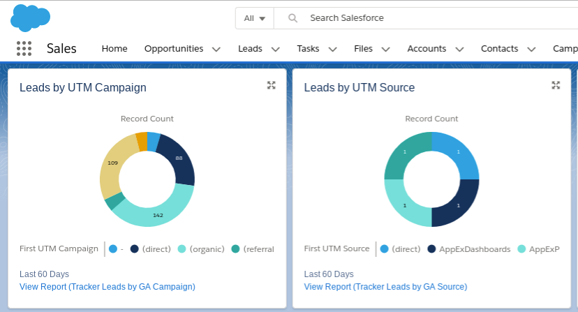
Even if your organization is new to Salesforce, you don’t need to start your dashboards from scratch. You can download a variety of free dashboards from the AppExchange in minutes, and edit them to fit your organization’s data and preferences.
Customizing existing dashboards not only saves you time, but it gives you a baseline of “best practices” of how others have designed their dashboards and created their reports. For more dashboard customization tips, see my How to Customize Salesforce Dashboards blog post.
Try to have one primary KPI (key performance indicator) dashboard for your organization, which consolidates key metrics from all across the organization into a single view. And even though Salesforce allows up to 20 charts per dashboard, keep this one simple – maybe 9 or 10 KPIs total, where everything fits “above the fold” (without scrolling down in your web browser).
You can also have a main KPI dashboard for each department or executive if you choose, but the important thing is to have one or a very small number of KPI dashboards that everyone in your organization sees as the authoritative measure of performance. Each functional area or department may have many additional dashboards that show the detail behind their different activities that roll up into those KPI dashboards, but those should only be used by those focused on each particular area of work.
One way to really maximize the power and usage of your Salesforce dashboards is to bring in additional data that might not be in Salesforce normally. If your Sales KPIs are in Salesforce, but other operational or business metrics are in reports that haven’t been integrated into Salesforce, your dashboards are not the single source of truth that they should be. Popular data sources are external marketing systems, product usage data, and finance data such as invoices.
Manually importing data into Salesforce periodically is one workaround, but then the automated updating of the dashboards with the most current data may be impaired. With tools like those above, you can make your Salesforce dashboards the authoritative source for how your organization is performing.
If you have Salesforce Enterprise Edition or above, as part of scheduling the daily or weekly refresh of your dashboards, you can also set them to sent out via email. These HTML emails look identical to your dashboards in Salesforce, complete with graphics of all the charts right there in your email inbox, which you can still click on to go through to the source report in Salesforce.
Emailing dashboards is a handy way to share information on a regular basis with team members, as well as with any Salesforce users who may not log in to Salesforce as frequently as they should. And for metrics that you may want to monitor as part of your daily work, such as incoming leads or registrations, starting the day with a cup of coffee and your morning dashboard emails will keep you well in the loop.
Want more on Salesforce Dashboards? Check out our blog post How to Customize Salesforce Dashboards.
| CloudAmp Apps for Salesforce |

|
David Hecht Founder, CloudAmp |
| CloudAmp Apps for Salesforce |
Know where your best Salesforce leads come from, and track marketing ROI more easily.